
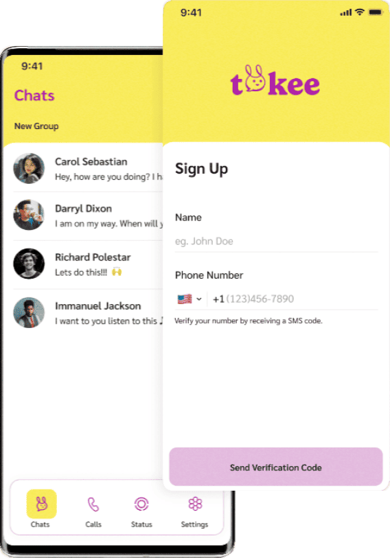
o v e r v i e w

a b o u t t o k e e

o b j e c t i v e s &
c h a l l e n g e s
The objectives encompass optimising user experiences for seamless, instant connections, enhancing interactions through innovative features, and crafting a visually appealing interface that fosters higher engagement and satisfaction levels. Through these objectives, Tokee aspires to set new standards for effortless connectivity.
This case study uncovers the challenges that the Tokee revamp project encountered, each requiring solutions to drive the app’s transformation amidst a competitive digital landscape.
Differentiation in a Crowded Market:
Tokee as a standout player in a saturated app market posed a significant challenge. Encouraging user migration demanded showcasing Tokee’s unique value and personalized experiences to entice users toward this fresh communication platform.
Technical Triumph over Performance and Scalability:
Enhancing Tokee’s performance for growth and scalability demanded meticulous attention. Tackling technical challenges required a deep exploration of its architecture, involving rigorous testing to ensure seamless user experiences, even during peak usage.
Data Privacy & Cybersecurity Assurance:
As user data protection took centre stage, the significant challenge was fortifying cybersecurity measures. Addressing these concerns entailed not only technical measures but also transparent communication to build trust in Tokee’s commitment to safeguarding private information.
d e s i g n p r o c e s s

01
Schedule
UX Audit

User Flow
User Pain Points

Information Architecture
Wireframes
Design system
UI Design
o n b o a r d i n g + c h a t s
u s e r f l o w

l o w – f i w i r e f r a m e s

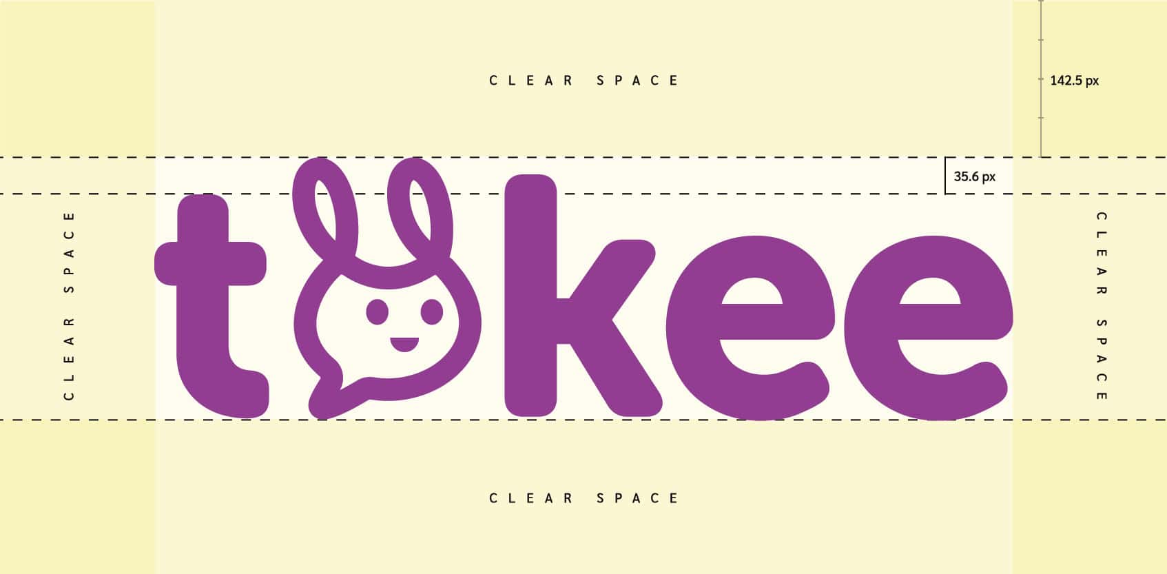
l o g o & B r a n d i n g

c o r e b r a n d v a l u e s & p e r s o n a l i t y
Youthful & Fun
W A R M
a u t h e n t i c
R e f i n e d
W A R M
G l o c a l
S t r a i g h t f o r w a r d
c a r i n g
M o d e r n


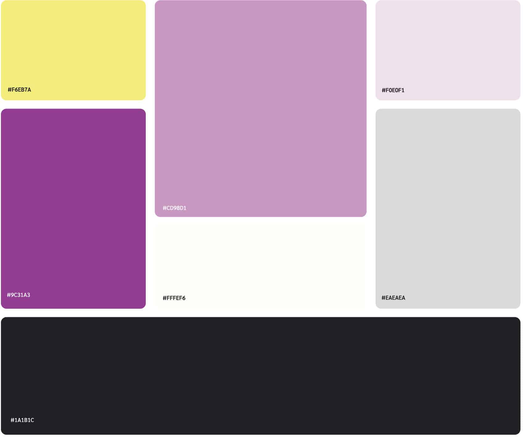
d e s i g n s y s t e M




T H A N K Y O U

