Landing page design for
a new-age messaging app
a new-age messaging app

Landing page design for messaging app
Overview
An app that believes connections are more than just words and enhances the experience of messaging to a whole new level.
This case study, discusses the design, user experience strategies used to design the landing page, to showcase the features of Wokii to
the world!
Services
Design Strategy
Content Strategy
UI/UX
Content Strategy
UI/UX
About Wokii
Enter the world where connections are beyond words.
Wokii redefines the messaging app through it’s plethora of features. It’s a place to express yourself not just through texts but, photos, videos, files and voice medium effectively. 150,000 stickers and more to keep express yourself and share yourself to the friends around you.
Bring your closest circle much closer through the group chat feature and keep your conversations going. With secure money management, Wokii is able to help you seamlessly transfer help urgently and immediately to your friends and family.


Design Process

Conducted a thorough analysis of the the competitor landing page and existing messaging app landing page landscape

Brainstormed solutions for a unified structure, visuals and iterated on wire-framing and prototyping an integrated design.

Executed strategies: Developing the information architecture, strategic placement of Wokii’s USP’s and developing it for high-conversion

Positioned Wokii as not just one another messaging app but, with unique selling features like stickers and offers that cater to a wide-range of audience around the world
Wireframes & Color schemes

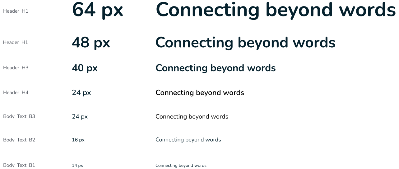
Type Scale

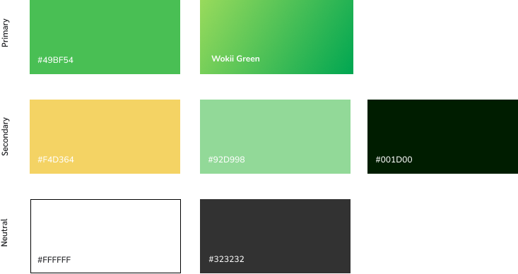
Colour

Home page
Our primary objective was to create a home page that effectively highlights the core features of our app and encourages users to take immediate action through a compelling call-to-action (CTA) button. We aimed to increase user engagement, improve conversion rates, and provide a seamless onboarding experience.

Highlighting app’s features
Our primary objective was to create a home page that effectively highlights the core features of our app and encourages users to take immediate action through a compelling call-to-action (CTA) button. We aimed to increase user engagement, improve conversion rates, and provide a seamless onboarding experience.


Responsive Screens
Recognizing the importance of mobile users, the landing page is fully responsive. It provides an optimal viewing experience across different devices, ensuring that the design elements and CTA button are effective on both desktop and mobile screens.


