BRANDING
UX/UI DESIGN
UX CASE STUDY

The Dating App for Long Term Relationships
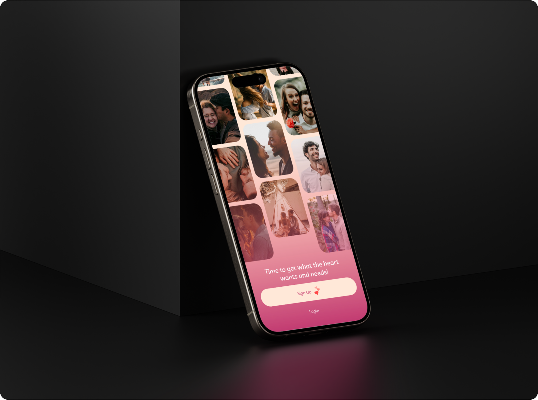
A case study on developing a dating app designed to foster serious relationships, with a focus on delivering a secure and user-friendly experience.
Service
Consumer Tech
Timeline
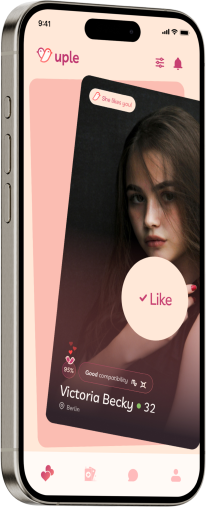
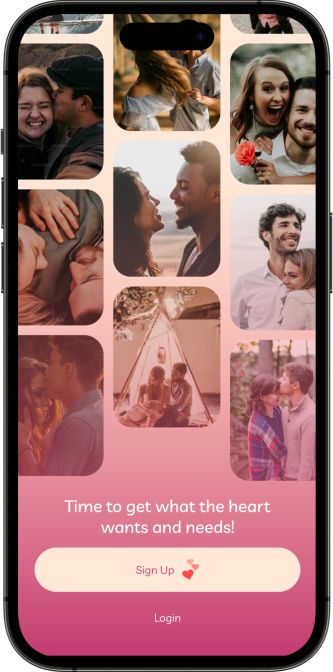
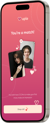
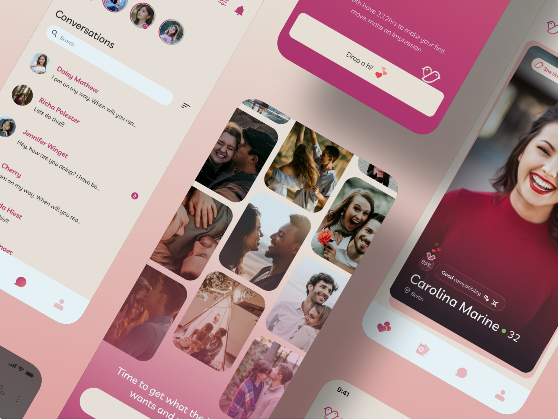
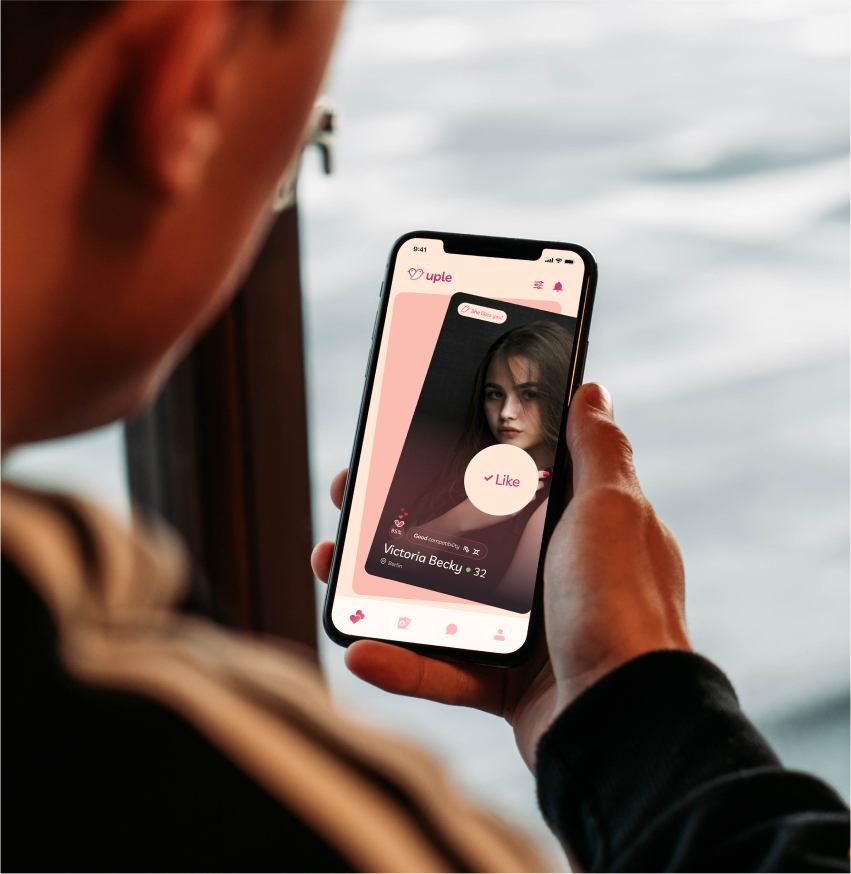
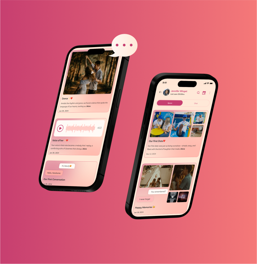
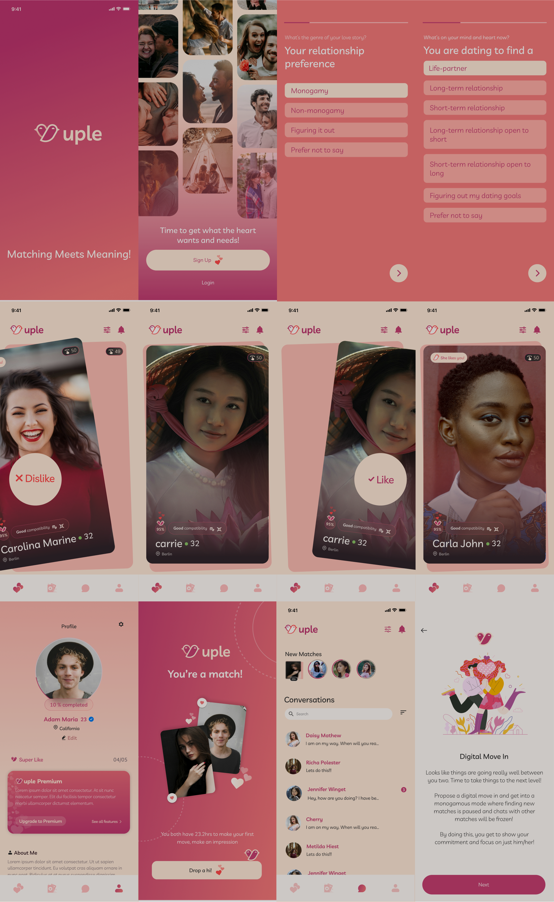
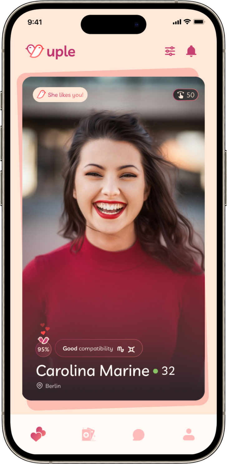
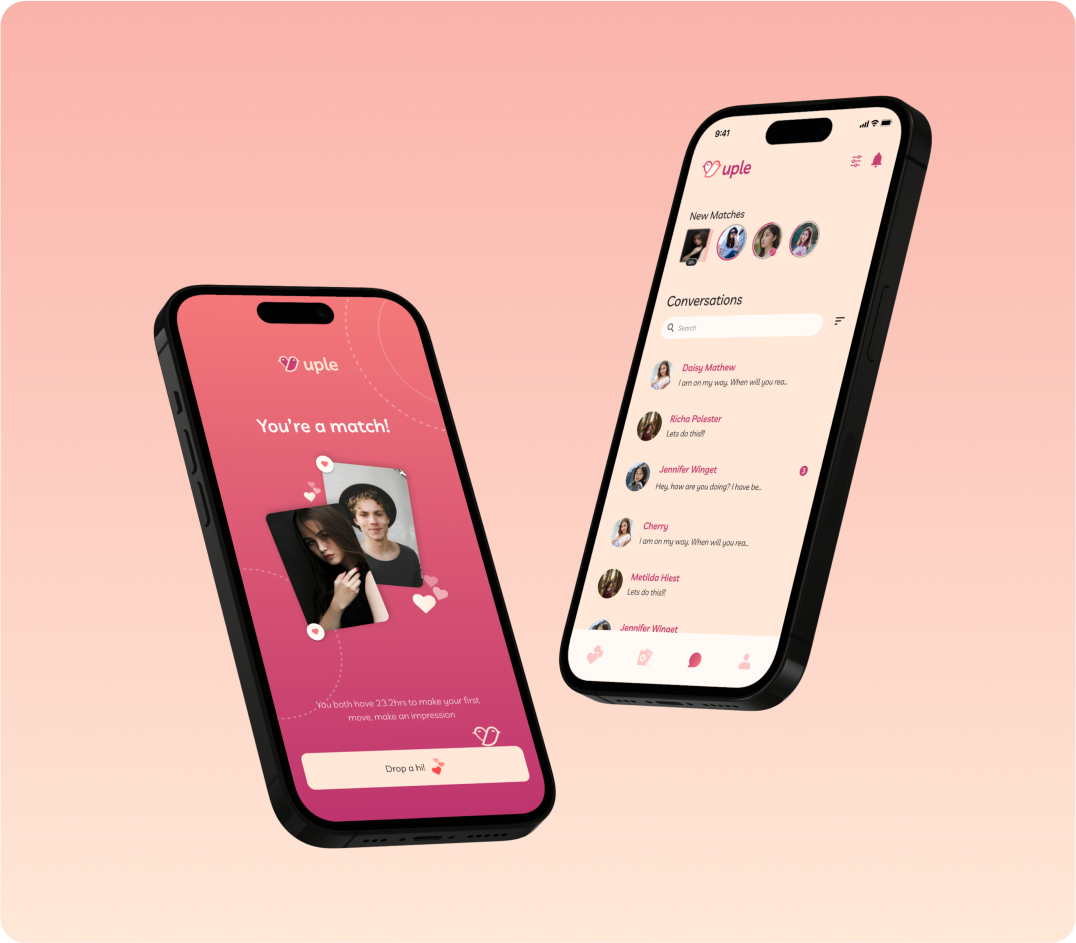
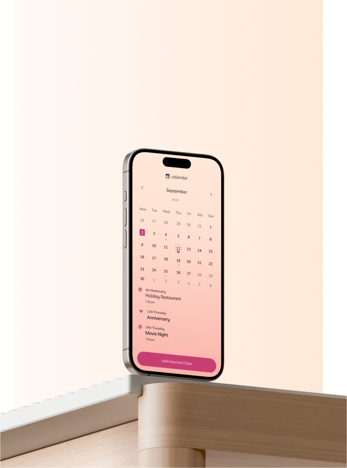
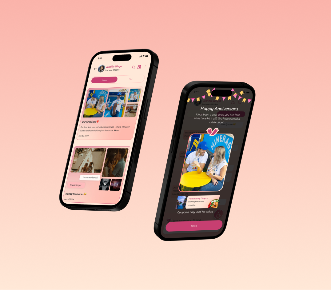
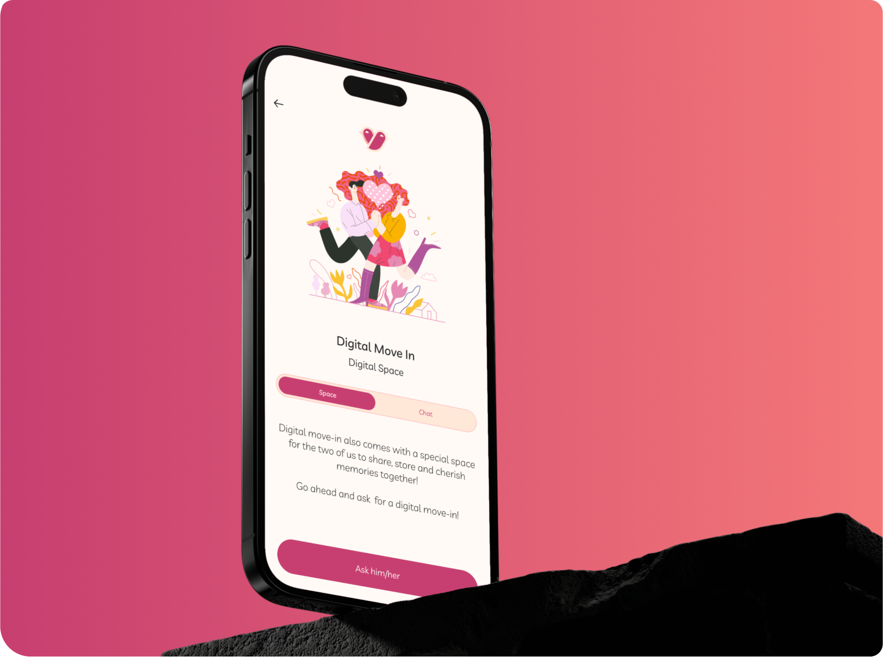
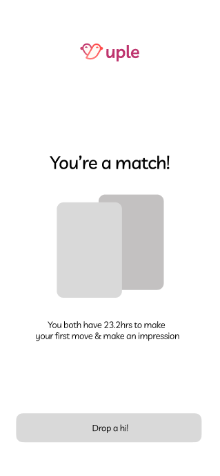
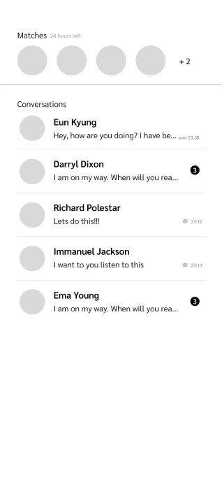
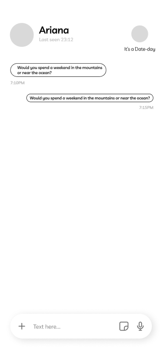
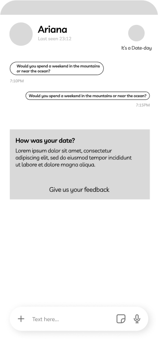
To design Uple, a dating app dedicated to fostering serious relationships, by creating a secure and intuitive platform. The app aims to enhance meaningful connections through innovative features such as digital move-in spaces, blind date quizzes, zodiac-based matching, and a supportive community for sharing advice. The ultimate goal is to offer users a seamless, engaging experience that promotes deep, lasting relationships.
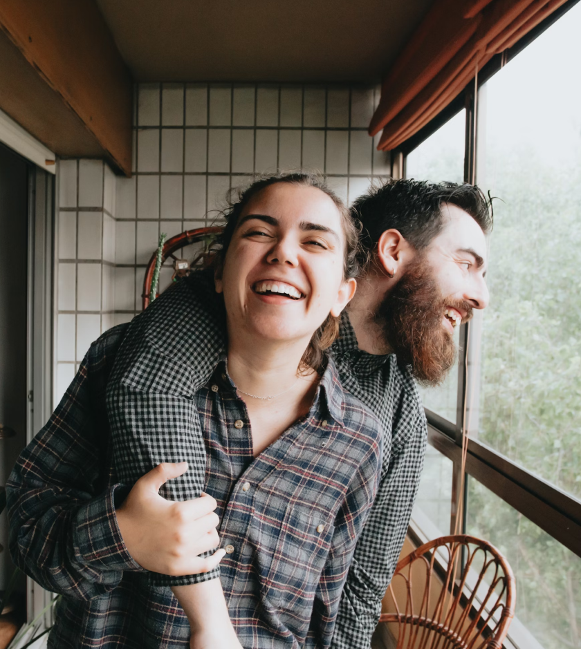
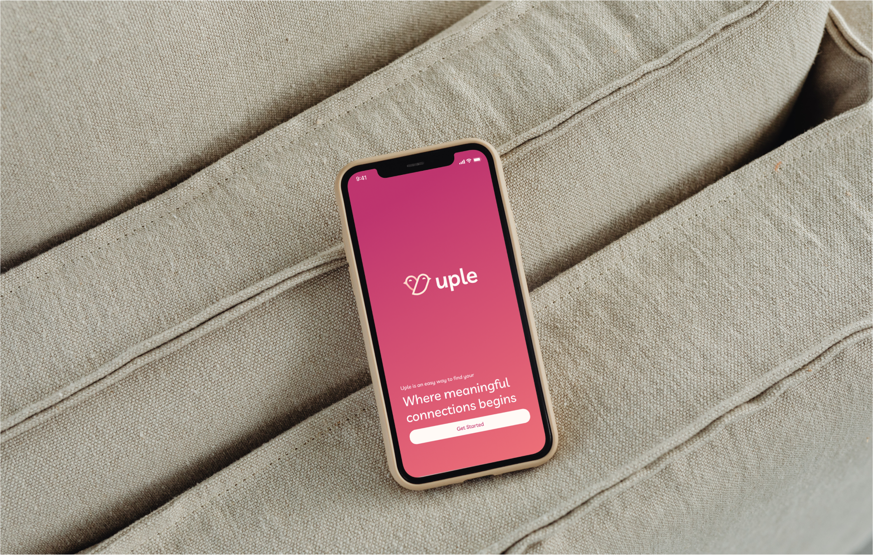
Uple is a name that gracefully intertwines the ideas of ‘Level up’ and ‘Couple,’ capturing the essence of growth and togetherness in the dating journey.
Short and playful, the name reflects a dynamic blend of connection and progress, inviting users to elevate their dating experiences.
With every interaction, Uple hints at the promise of finding that perfect match, where shared moments become the foundation of something lasting and true
PRODUCT DESIGN
d e s i g n p r o c e s s

01
Roadmap Schedule

User Flow
User Pain Points

Information Architecture
Wireframes
Design system
UI Design
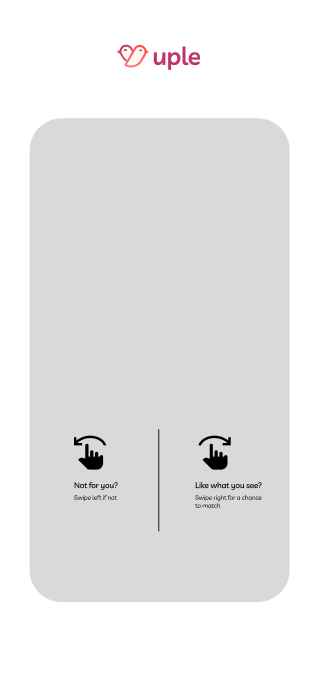
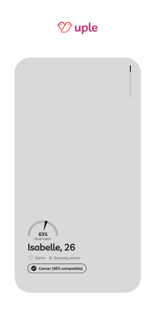
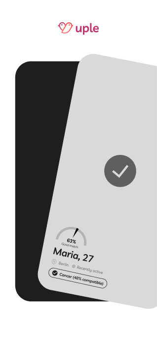
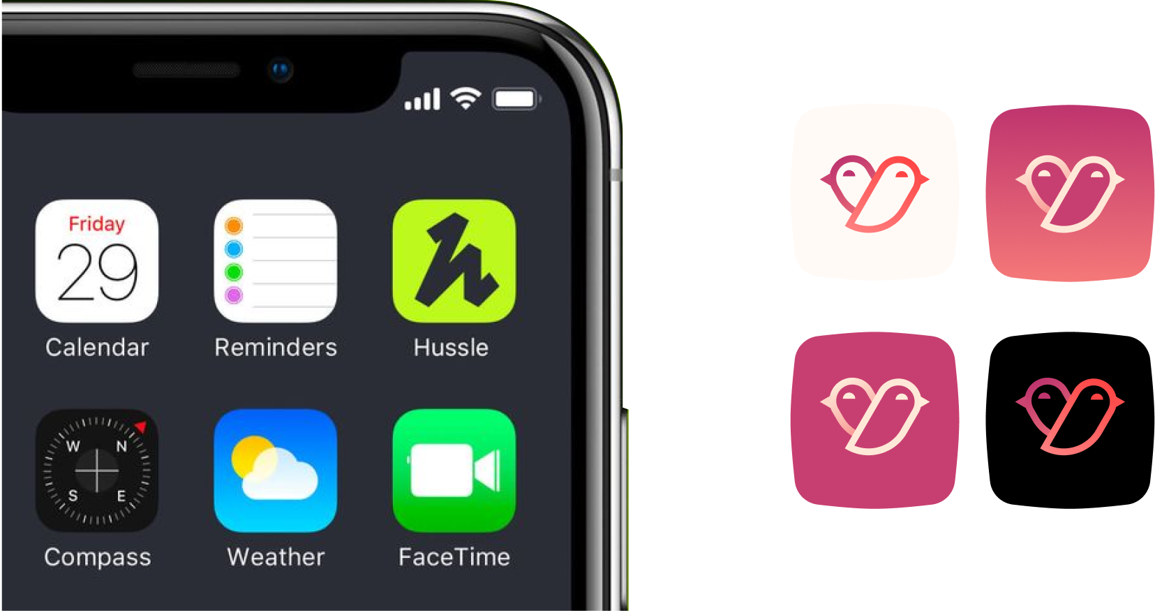
Just as lovebirds mate for life and form unbreakable bonds, “Uple” is the place where lasting relationships are nurtured. The logo’s design is not just adorable
—it represents the stability and strength of a mature, committed relationship.

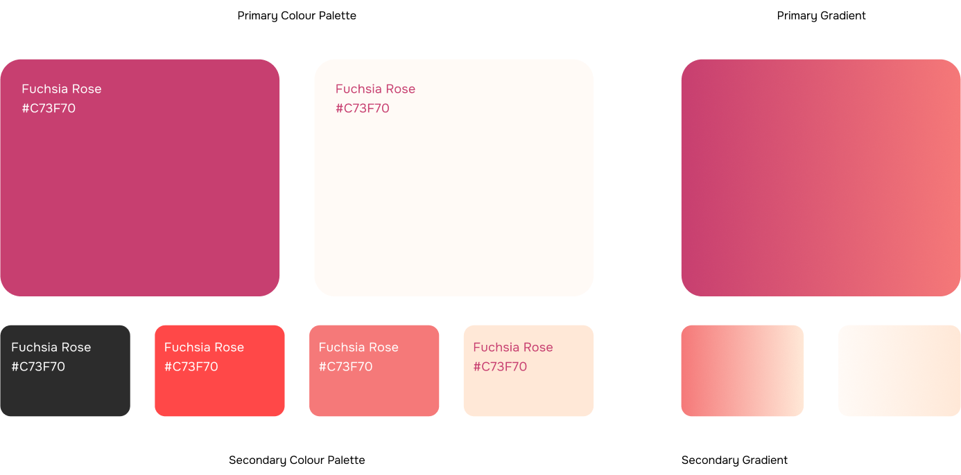
Aa Bb Cc Dd Ee Ff Gg Hh Ii Jj Kk Ll Mm NnOo Pp Qq Rr Ss Tt Uu Vv Ww Xx Yy Zz
